New in Fabman: Spanish member app, non-prorated packages, revamped settings, better member search
We’re constantly improving Fabman. Here are the most notable changes we’ve made over the past few months:
- ¡Hola! The member app is now available in Spanish!
- New options for filtering your member list
- Packages that are not charged in proportion, i.e., sane annual packages
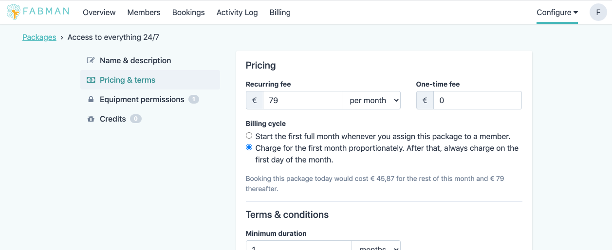
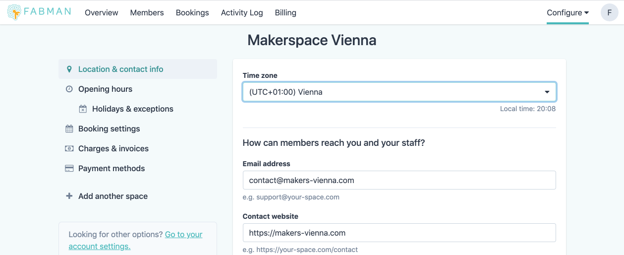
- Revamped package and space settings
Spanish member app

The member app is now available in Spanish – thanks to help from the kind people at Cuadrilla in Bogotá, Colombia. We also used the opportunity to improve the German translation.
If your members have set their browser’s language to Spanish, they’ll automatically get the Spanish version. But they can also choose a language on their preference page.
New member filters

We’ve added several new filter options to the member list. You can now search for members who …
- … currently have a particular package (or set of packages),
- … have completed a certain training course.
These options double as a quick and easy way to check how many members have booked which package.
(All these filters have already been available via the API for a long time. But we hadn’t put them into the app.)
Packages that are not charged in proportion, i.e., sane annual packages
Up until now, if you added a monthly package to a member on the 15th of the month, they were immediately charged for half a month and then charged for a full month on every first of the month. Originally, we believed that this simplified billing because you know that all monthly charges can be invoiced at the first of the month.
But these odd first charges can create confusion among members. (“Why did you charge me € 6.37 for my ‘€ 9 per month’ package?") And it gets outright ridiculous for annual packages.
So we’ve improved how packages get charged. Now you can choose to let the first full week/month/year start right when you give someone the package and renew on whatever day of the week/month/year you assigned it. No more partial charges!
We won’t touch your existing packages, but all new packages will default to this new option. As they always should have.
Revamped package and space settings (and every other page)
Speaking of packages, we’ve completely redesigned their settings page. The old one had grown over time – until it became unwieldy. So we’ve split it into tidy categories. And the list of permissions a package grants is now much easier to understand at a glance.

The same goes for the settings page of your space. Gone are the five(!) different forms hidden behind just as many edit buttons, scattered across the page. 🙈 Now it’s all in one place:

But we didn’t stop there. We went through every single page of Fabman, tweaking lots of little things – and even some bigger ones. The overview page got a new layout (if you use check-ins). The booking calendar got slightly more space-efficient – as did many lists, especially on mobile devices.
We hope you like it!
Other changes
As always, we’ve also added a whole lot of smaller fixes and improvements since the last announcement. Here are some of them:
- If members are only allowed to book during opening hours, then the booking calendar for members will only show them those hours instead of the whole 00:00-24:00 grid. (And in the admin app, you can choose whether to show only the opening hours or everything.)
- You can export your bookings as CSV, just like the member list.
- Fix: The booking calendar for members wrapped some long date formats when it shouldn’t.
- Fix an issue in the booking calendar if your opening hours are ending at midnight. (Just in case anyone is running a space for night owls.)
- Fix an issue that made it really, truly annoying to manually edit some date fields (like a holiday’s date or a charge date) in the admin app. I’m sorry we didn’t catch this sooner.
- Fix several glitches when using the booking calendar to book on a day with DST changes.
- Member portal: Fix original start and end time not being shown correctly when editing a booking.
- Member portal: Fix an error when reloading the „cancel booking“ page.
- Member portal: Fix some special characters being displayed as HTML escape sequences (eg., „10&x2F;09&x2F;2020“ instead of „10/09/2020“)
- We now ask you to confirm your action when you delete a charge. Better safe than sorry.
- Cancelling a member package on the day before it was created now shows a descriptive message instead of a general „oops“ error.
- You can now always change which payment is associated with which invoice, even after you created the payment. If you’re using Stripe, we also update the payment details in Stripe. This means your Stripe console also always shows you the invoices associated with each payment.
- Fixed a potential error when sending members a payment link to confirm their payment.
- On one spot of the payment form, we always displayed the amount as being in EUR – even if your account was set to a different currency.
- Fix: after replacing a member’s payment method, the admin app sometimes still displayed the old one for a few minutes.
- Payment methods API: You can now provide your own SEPA mandate reference if you already have one.
- Our full-text search doesn’t throw up anymore if you search for unusual white-space characters.
- Attachments: If you add an SVG, it will now be displayed as an image instead of just a download link.
- Member portal: Fix an error when navigating back to the QR scanner using Mobile Safari.
- After canceling an invoice that belonged to an already-deleted member, we tried to redirect you to that member’s detail page – which didn’t exist anymore. Oops.
- Admin overview: We no longer automatically close any activity popups whenever we refresh the list of activities in the background.